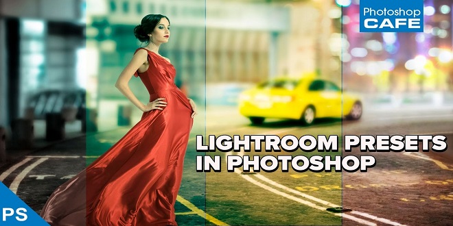
Compositing is a skill and process that spans the entire spectrum of creative industries. At the high end, compositing boasts its own specialized profession in film and television post-production and visual effects. Dedicated software such as NUKE and Shake have taken the craft to powerful levels of its own, leaving behind the relatively basic compositing toolset of Adobe Photoshop.
However, for many graphics practitioners compositing is a vital everyday process and as with all pixel-pushing endeavors, Photoshop remains the entry point and hub to learning and ultimately mastering the fundamentals of this important skill.
Matching Tones Channel by Channel
One of the challenges we face when compositing is matching the colors and tones of various images to produce a realistic and convincing composite. This method aims to save you from spending time fiddling around with color balances and layers upon layers of adjustments, by showing you a systematic approach that should become second nature and enhance your compositing skill set.
In the following example, we will composite three people into one shot and address the differences in lighting, tone, and color balance. I use this technique most often as a way of quickly grouping my subjects into a similar tonal range for further global color adjustments.
Visual Evaluation
We are now entering the exciting world of greyscale tonal evaluation, deep inside the channels of our RGB image the bare bones of bitmap imaging. We are going to go through each channel of the image and simply try to match the greyscale luminance levels to the target layer.
Gradient Map with Soft Light
Although this is not essentially a compositing technique, it is an especially useful adjustment to perform on a composited image, where the colors and tones often require this type of homogeneous tweaking and subtle realignment. This technique works well as a final adjustment to an image. It has the effect of bringing all colors and tones slightly closer together, whilst still retaining their independence and relevance to the whole image.
We are going to set ten points on the gradient bar with colors picked directly from our image going from darkest to lightest. First, click on the black point of the gradient and hover over the image; you should see the Eyedropper tool. Locate the very darkest point of your image and click; if it is black or very close to black, you won’t see much change in your gradient map. Now click just below the gradient bar, a small space away from the gradient point you just changed, to add a new gradient point.
Turn on the visibility of the gradient map layer once more. You will probably see a frightening rendering of your carefully composited image, and you may be wondering now what you have just gone and done. Don’t worry; this is to be expected. Change the gradient map layer’s blending mode to Soft Light and reduce the opacity until you are happy with the image once more. Check the change by toggling the adjustment layer visibility on and off.
The tattoo culture has experienced a significant rise in popularity over the years, becoming more mainstream and widely accepted. Tattoos have a long and rich history, serving as a form of self-expression and a symbol of cultural significance. From ancient civilizations to modern times, tattoos have held various meanings and purposes.