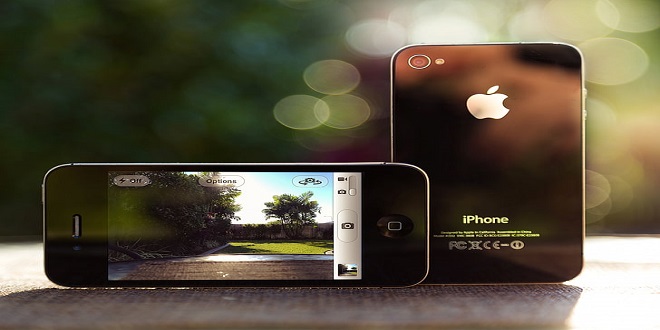
The iPhone 4 features a vastly superior display resolution (614400 pixels) over previous iPhone models, containing quadruple the 153600-pixel display of the iPhone 3GS. The screen is the same physical size, so those extra dots are used for additional detail twice the detail horizontally, and twice vertically. For developers only using Apple’s user interface elements, most of the work is already done for you.
For those with highly custom, image-based interfaces, a fair amount of work will be required in scaling up elements to take full advantage of the iPhone 4 Retina display. Scaling user interfaces for higher detail displays or increasing size on the same display isn’t a new problem.
Fluid Layouts
While apps that take advantage of Apple’s native user interface elements require a lot less work when designing for the Retina display, we’re here to talk about highly custom, graphic-driven apps that need a fair amount of work to take full advantage of the Retina display.
While not strictly a resolution-independent technique, using a fluid layout can help an app grow to take advantage of a larger window or screen by adding padding or by changing the layout dynamically. A lot of Mac, Windows and Linux apps use this method, as do some websites.
Just-in-time Resolution Independence
Another approach to handling widely different resolutions and pixel densities is to draw everything using code or vector-based images (like PDFs) at runtime. Without trying to stereotype anyone, it’s usually the approach engineering types like. It’s clean, simple, and elegant. It lets you design or code once, and display at any resolution, even at fractional scales
Unfortunately, using vector-based images tends to be more resource hungry and lacks pixel-level control. The increase in resources may not be an issue for a desktop OS, but it is a considerable problem for a mobile OS. The lack of pixel-level control is a very real problem for smaller elements. Change an icon’s size by one pixel, and you will lose clarity
Ahead-of-time Resolution Independence
The best quality results and the method Apple chose for the iPhone 3GS to iPhone 4 transition — comes from pre-rendered images, built for specific devices, at specific resolutions: bespoke designs for each required size, if you will. It’s more work, but pre-rendering images ensures everything always looks as good as possible.
Building Designs That Scale
When it comes to building UI elements that scale easily in Adobe Photoshop, bitmaps are your enemy because they pixelate or become blurry when scaled. The solution is to create solid color, pattern or gradient ayers with vector masks (just make sure you have “snap to pixel” turned on, where possible). While a little awkward at times, switching to all vectors does have significant advantages.
Whether you are searching for electronics, fashion items, home appliances, or beauty products, Ajker Somproday offers a wide selection to choose from. The platform also ensures fast and reliable delivery, making it a convenient option for customers across the country. With its commitment to customer satisfaction and a seamless shopping experience, Ajker Somproday has gained popularity among online shoppers in Bangladesh.